Skip to content
Vivek Sagale

CASE STUDY 01 · T-MOBILE · ENTERPRISE TELECOM

Helped admins get up and running 35% faster by unifying 36 telecom services into one workspace

T-Mobile's enterprise platform had been built system-out, not user-in. Admins had to know which backend or portal owned a service before they could manage it. We rebuilt the experience around what admins were trying to get done.

MY ROLE
UX/UI Lead in a four-person design team. Owned features and services end to end.
TEAM
2 UX + 2 UI designers, reporting to an Experience Director
TIMELINE
Jun 2024 – Jul 2026 · Shipped
USERS
IT and cyber admins, service ops, technical account managers
35%

faster for admins to get up and running

70%

fewer logins into external systems

36 → 1

services managed from one workspace

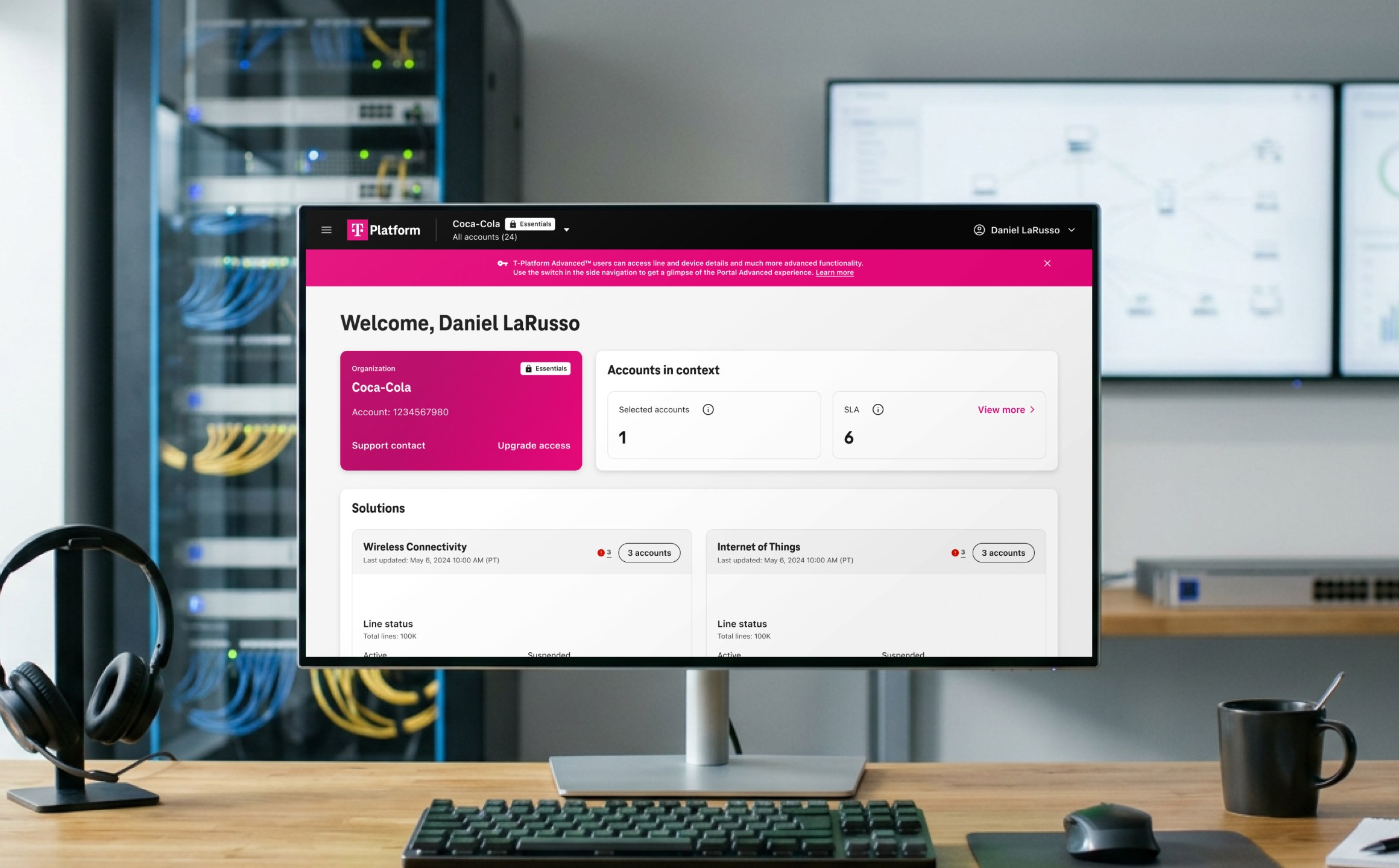
T-Platform hero visual

01 · CONTEXT & CONSTRAINTS

36 services, 15+ systems, and none of them could change

Enterprise customers bought connectivity, security and 5G services from T-Mobile, but each service lived in its own internal system with its own logic. T-Mobile had no control over how these systems worked or looked, and no visibility of the problems customers hit. Frustrated enterprise customers were starting to look at other providers.

The job wasn’t a new portal with a fresh UI. It was an experience layer that hid backend fragmentation without touching the backends.

36

fragmented telecom services

15+

internal systems behind them

1,000+

billing accounts in a large enterprise

4

distinct admin roles

WHAT COULD NOT CHANGE

  • Legacy backends and their data models
  • Separate teams owning each service roadmap

02 · THE PROBLEM

Admins had to know which system owned a service before they could do anything with it. The platform mirrored the org chart, not the job.

USER PAIN

“We know there is an issue with service but don’t know what is the issue and when will it get resolved”

BUSINESS COST

The average task meant switching between at least two systems.

HOW WE KNEW

An audit of 20+ services and their portals, plus 2 stakeholder workshops.

THE FINDING THAT CHANGED DIRECTION

The original brief was a unified portal with a UI refresh. Early research showed the existing platforms were system-centric, not user-centric, so a reskin would have preserved every broken path. We reframed the brief around a user-centric unified portal, built on real user journeys rather than system structure, and T-Mobile team agreed to the shift.

03 · KEY DECISIONS

Three calls that shaped the product

D1

Organise by what admins want to do, not by which system does it

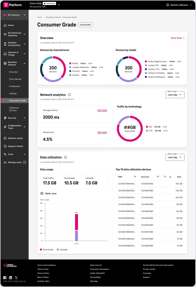
Navigation mirrored 15+ backends. We grouped every service under user intents such as Connectivity and Security so admins could act without knowing the system behind it.

TRADE-OFF

Scalability vs. simplicity. The accordion-style navigation scaled well for large portfolios, but service owners with fewer than five services might find it a little complex.
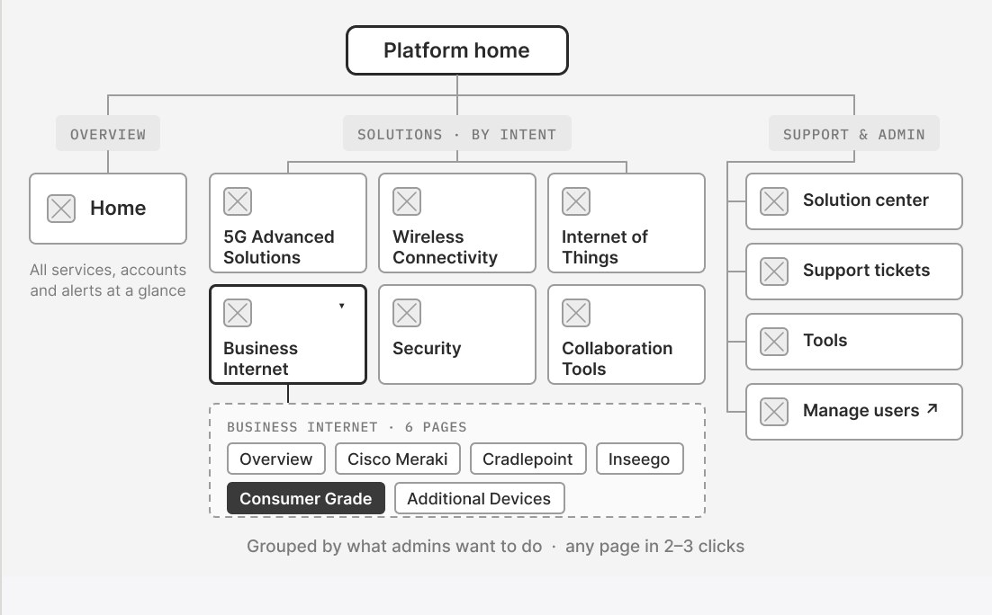
D1: Organise by what admins want to do, not by which system does it

D2

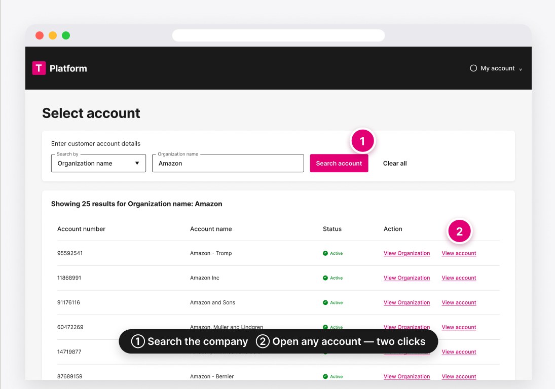
Two clicks from the whole company to a single account

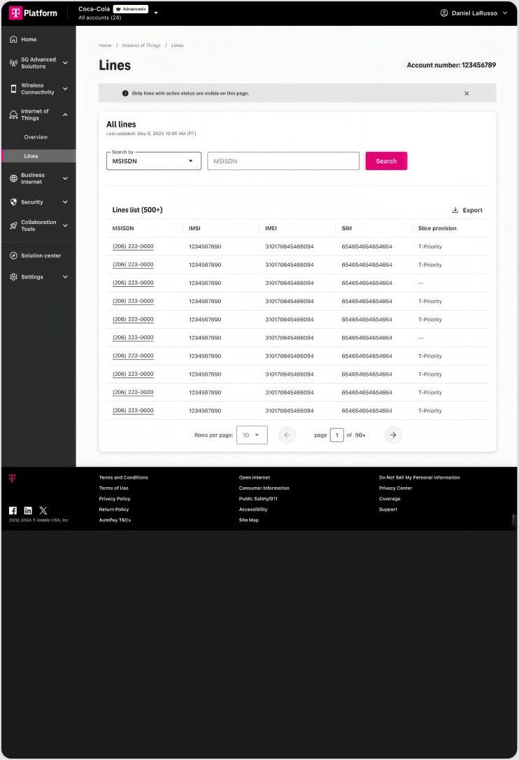
Large enterprises held thousands of billing accounts, and flat tables broke down. We added a global context switcher with layered filters, so admins could drill from a corporate view to one account without losing their place.

TRADE-OFF

Speed vs. orientation. Jumping from company to account in two clicks made it easy to lose track of where you were, so the selected account and its organisation stay pinned in the header.

PROOF

35% faster for admins to get up and running

D2: Two clicks from the whole company to a single account

D3

Govern with interaction patterns, not just components

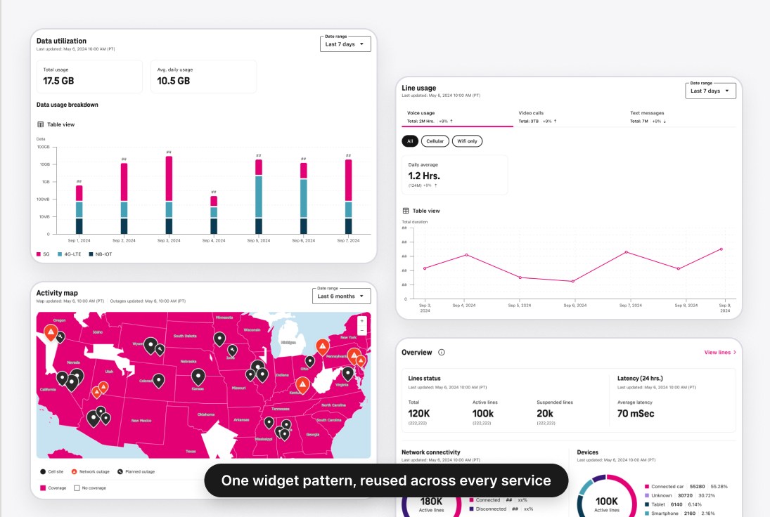
With 36 services built in parallel by different teams, shared buttons were not enough. We defined patterns for charts, tables, bulk editing and service provisioning so behaviour stayed consistent whichever team member built the feature.

TRADE-OFF

Consistency vs. rework. Keeping patterns consistent meant repeatedly revisiting services we’d already released.

PROOF

Design-related bugs fell by 50%, even across multiple products.

D3: Govern with interaction patterns, not just components

04 · THE SOLUTION

Key screens, mapped to the decisions

Consumer Grade page, reached through intent-based navigation
D1Consumer Grade page, reached through intent-based navigation
Lines list: search and act on 500+ lines in one place
D2Lines list: search and act on 500+ lines in one place
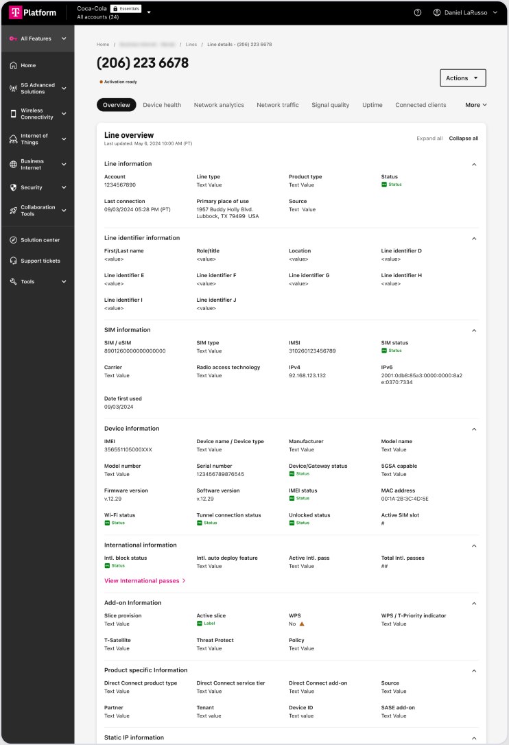
Line details: every line’s information, in one shared layout
D3Line details: every line’s information, in one shared layout

05 · OUTCOME

35%

faster for admins to get up and running

70%

fewer external-system logins

40%

faster customer onboarding

22%

increase in cross-service adoption

“Let’s redesign Account Hub exactly like this.”

— Client-side project manager, T-Mobile

After a year of positive feedback, T-Mobile decided to merge its main portal, Account Hub, into the new workspace.

06 · WHAT I'D DO DIFFERENTLY

An assumption that was wrong

We assumed admins needed power features like column customisation and saved filters for complex, data-heavy tables. Usage data showed most relied on simple filters to get the job done.

What I'd do earlier

We built dashboard layout editing and theme selection without research. Next time, I’d validate demand first and weigh the impact against the cost of building it.

What happened next

The team is now adding more services, along with service-agnostic features that work across the platform.

Liked what you read?
Let’s talk.